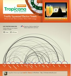
 In an email today, William Beutler, Innovation Manager at New Media Strategies, pointed to a new site that launched on election day:
“Created by my team at New Media Strategies and powered by our long-time clients Tropicana/PepsiCo, we’re calling it Freshly Squeezed Election Tweets.
“Tropicana is a longstanding client of NMS, and they wanted to create a micro-site for the election, something cool and useful. So together we agreed a data visualization tool would be the way to go, and Twitter is the obvious choice. So we found we were on the same page and went for it. The best thing? It all came together over the weekend. The actual site-building didn’t begin until Sunday, and it’s working like a charm.”
Finalized over the weekend with a sponsor, built on Sunday and launched on Tuesday. Now that’s speed to market. Not bad.
It’s a visualization of the aggregated Tweets on Twitter, showing the frequency and context of election-related words, Beutler said.
Terms are expressed as “bubbles.” Here’s how Beutler explains it:
The bigger the “bubble” the more frequently the term is being used. Each bubble is colored red and blue: the more red, the more the term correlates with McCain, the more blue, the more Obama. Keyword bubbles are themselves connected by half-circles (solid colors only), showing relationships between them. The stronger the connection, the thicker the line. And a bit later today, we’ll add a feature so you can sort by time periods.